Top 5 Mistakes Made by Beginner Hand Letterers

Hand lettering is an awesome and profitable art form that you can learn pretty easily on your own through practice and with online tutorials, courses, and guides.
But without a teacher checking over your work regularly, there are some common pitfalls that beginner letterers are likely to fall into.
In this post, I’ll share with you the most common mistakes I’ve seen beginner letterers make (and that I made when I started out too!), and how to correct them so that you don’t spend time practicing bad habits!
Mistake #1: Writing Instead of Drawing
The most important concept to wrap your head around when it comes to hand lettering is that you are drawing letters, not writing them.
We all have our innate handwriting ingrained in us, baked into our muscle memory. When you’re lettering, you should actually try your best not to rely on those deeply ingrained patterns. Writing is a skill meant to get a message across as quickly and easily as possible. Hand lettering, on the other hand, is more about communicating a message and feeling through intentional and deliberate illustration and decoration of specific letter forms.
Try This:
In my lettering workshops, I always start with a warm up exercise where I write the word “learn” on the board and ask participants to copy it down themselves on a piece of paper. Then, I write the word “学ぶ” on the board and ask them to copy it down as well.
Since my workshops are mostly full of native English speakers who have never studied Japanese, the second prompt is much more difficult for them. They squint up at the board and copy down the characters one stroke at a time, seeing them as shapes without any meaning. On the other hand, for the first prompt they looked at the board once and then used their muscle memory and prior knowledge to write the English word “learn” with their handwriting.
The point of this exercise is to realize the difference between the two different processes. I encourage all my students, as they learn hand lettering, to try their best to see the letterforms they’re practicing in the same way they saw those Japanese characters. This subtle shift in how you perceive letters (as shapes instead of as writing) can make a huge difference in the execution of your lettering.
Mistake #2: Not Using Guides
The second biggest mistake I see is not taking the time to set up and use guides for lettering.
Guides are not just a tool for beginners; professional letterers know that using guides is essential for creating a well laid out composition and keeping lettering consistent.
As a minimum, draw out your basic horizontal guide lines: a baseline, x-height, ascender, descender, and cap height (if you’re using uppercase letters). These guides will help you create consistently sized letters across your word and give your work a professional look.
If you’re doing script lettering or lettering at a slant, you’ll want to create angled vertical guidelines as well to help you keep that slant consistent:

Even if you’re not lettering at an angle, vertical guides can help you keep your letter width and the space in between your letters consistent as well, which is also very important:

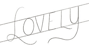
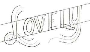
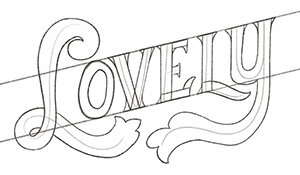
Mistake #3: Not Drawing Letters in Stages
The best habit to get into to improve your lettering skills is to build up your letters in three steps: the skeleton, the weight, and the decoration.
Start by drawing just the “bones” of your letters – a single line that will represent the center of your letterform. From there, draw weight (aka the thickness of each stroke) on top of the skeleton, taking care to make sure your weight is consistent across each letter. The last touch is to add decoration: serifs, flourishes, inlines, outlines, shading and extrusions, etc.
These 3 steps are illustrated in the images below:
Many new letterers will try to go straight to at least drawing weighted letters (#2) right from the get-go, if not trying to draw the weight and the serifs (#3) at the beginning.
But this will often result in letters having inconsistent weights, weird spacing, and imperfect shapes. Instead, by following this process of building letters up in stages, your letters will be much more consistent and clean looking.
Mistake #4: Trying to Do Too Much
This one has consistently been the hardest advice for me to follow: do less!
I love trying out different styles, layouts, and types of lettering, and I think many new letterers get excited by these endless possibilities also. But mixing too many different styles of lettering in one piece, or trying to learn too many new things at once, only lessens the effectiveness of each one.
Try your best to stick to one or two new lettering concepts to learn and practice at a time – whether that’s a couple different styles, or a couple different decoration techniques. A good rule of thumb in general is to stick to only 1-2 lettering styles in a single piece (unless your piece is purposefully using a bunch of different styles, as if to give a feeling of wackiness or being all over the place).
Even in your layouts for lettering full phrases, less is usually more. Instead of trying to fit a bunch of different shapes together, try simply lettering all of your words at one consistent angle. Or use just a couple shapes in your layout to evoke symmetry and consistency.
The bottom line: don’t overcomplicate things!
Mistake #5: Comparing Yourself to Someone Else
This is arguably the most important mistake to try not to make as a new letterer. It’s easy to get on Instagram or Pinterest and see all the amazing art that other letterers are creating, and then turn back to your own and feel… disappointed.
But you absolutely have to keep in mind that you are most likely looking at someone with YEARS more experience than you. They didn’t develop those talents overnight, and at some point their lettering probably looked exactly like yours does today.
The old adage “don’t compare your beginning to someone else’s middle” is particularly true here. Yes, you may not be exactly where you wish you were skillswise today, but that’s what’s going to keep you trying and practicing and developing as an artist. Embrace the gap between the lettering you envision yourself creating in your head and the lettering your hand can actually output right now, and limit your social media/inspiration intake if it helps! Focus on you and your progress – there’s nothing too small to celebrate!
Were you making any of these mistakes? Have you learned from any other mistakes you made when you began lettering? Share ‘em in the comments!