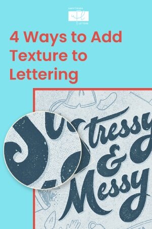
4 Ways to Add Texture to Lettering in Procreate
iPad lettering in Procreate is a total game-changer when it comes to creating artwork full of texture and depth, thanks to the ubiquity of unique custom texture brushes. There are tons of Procreate brushes out there that boast of being able to add texture to your lettering to transform it into stunning pieces of art. And they can… if you know how to use them.
Unfortunately, a lot of Procreate brush sellers don’t quite teach you how to get from the flat lettering you’re doing now with the Monoline brush to the gorgeous, textured lettering and artwork in the sample images that come with the brush pack.
In this post, we’ll look at 4 simple ways you can add texture to your lettering in Procreate to evolve your pieces with any textured brushes!
1. Use a Textured Brush to Draw Your Letters
This is the simplest technique to add texture to your lettering.
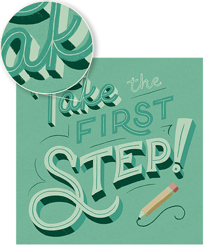
If you use a brush that has texture in its grain to draw your letters out in the first place, you’ll have texture baked into your piece from the beginning!
You might be wondering what a “grain” is though? That’s what Procreate uses to refer to the pattern that your brush is drawing with.

A speckled grain source + a rough, pencil-like shape source results in a sketchy line from the default 6B Pencil brush in Procreate
The type of textured brush you choose will create a different feel for your lettering. If you use a pencil brush, like any of the defaults in the Sketching section, your lettering will feel very hand-drawn, with an authentic, rough feel to it.
Below, the 6B Pencil brush is used for sketchy, hand-drawn texture in the first image, while the Growler brush is used for outlines with texture in the second.
Try out some different brushes and see which one gives you the feeling you’re looking to emulate in your artwork!
My go-to’s:
Growler for sketchy texture (from Idle Letter’s Sketchers pack)
6B pencil (Procreate default in Sketching section)
Dry Ink (Procreate default in Inking section)
Dry Sponge (from Idle Letter’s Inkers pack)
2. Add Overall Texture to the Background or Letter Surfaces
Another really simple method to add some intriguing texture to your lettering composition is to simply place it subtly all over the background of your piece and the surface of your letters.
You can do this trick with all kinds of different texture brushes; it just depends on the feeling you want in your piece. If you’re going for a…
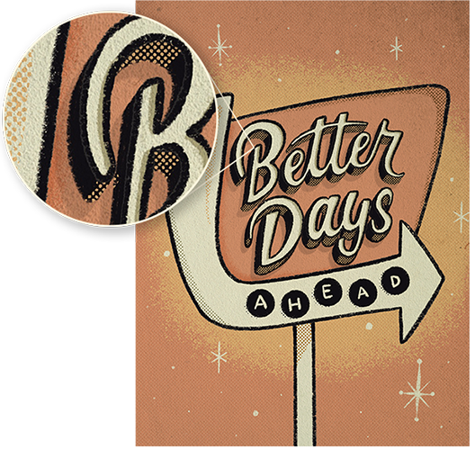
retro or printed look? You might want to use a brush with halftone dots.
hand-printed vibes? Try a print texture brush with some grunge to it.
subtle, even background texture? Try a speckled or grainy brush
bold statement background? You might opt for a pattern like wavy lines or dashes
Below, a print texture brush is used for distressing letters in the first image, along with a halftone brush for the background. In the second image, a dashed line pattern brush is used for bold texture on letter surfaces.
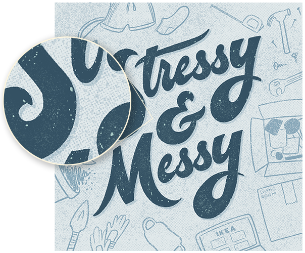
All of these can be achieved by picking your texture brush, selecting a color that is either slightly lighter or slightly darker than your solid background, and painting all over a new layer above the background.
I often also reduce the opacity of this layer to make it more subtle – I like to hit that sweet spot where the background texture is noticeable and creates cohesion with the textures in my lettering or illustration, but is not too overpowering.
3. Create a Retro Vibe with Halftones
Halftones are dots or lines that, when printed with different densities, give the optical illusion of areas being darker and lighter in shade even when the same color is being used. Technically, this is helpful to printers so that they can produce more tones with less colors of ink. But practically, in this age of digital illustration, halftones lend themselves well to adding interesting textures that evoke a feeling of retro printed work.
While Procreate is lacking in its default halftone brushes (try Rosette in the Textures section or Honeyeater in the Vintage section), there are tons of halftone brush packs available for purchase by digital asset creators (like Beat Tones by True Grit Texture Supply or Dirty Halftones by ShoutBam).

Try adding halftones in a slightly darker shade to your letters anywhere you want to shade, or in a slightly lighter shade anywhere you want to highlight. Or, as mentioned in tip #2, you can paint halftones subtly all over the background of your piece or the surface of your letters to lend a retro vibe to your illustration overall.
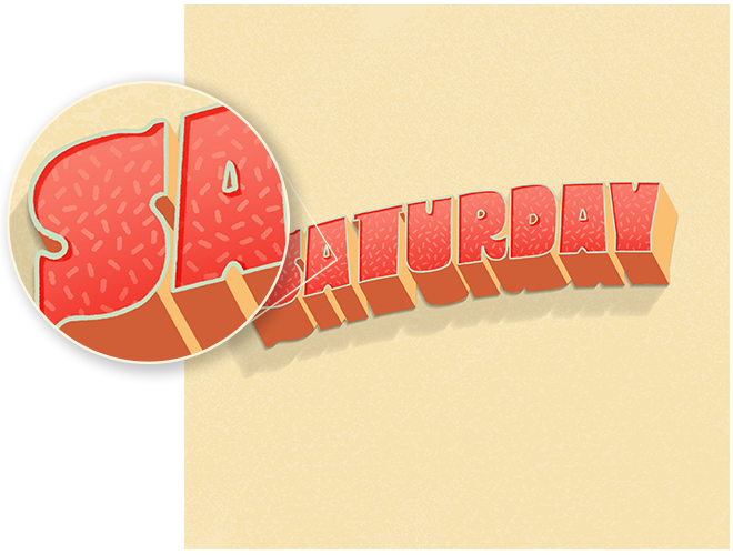
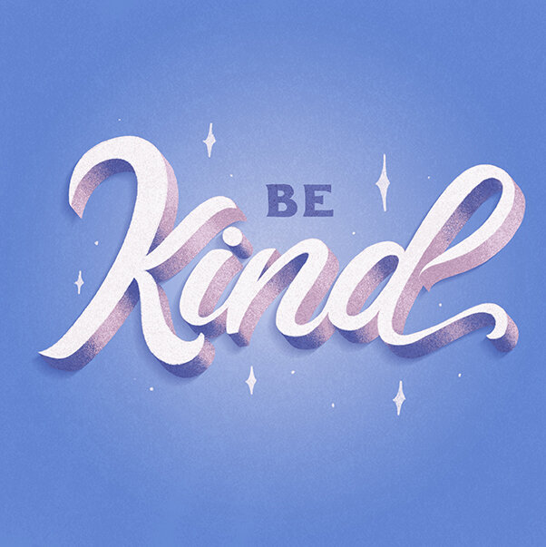
4. Use Grainy Texture Brushes for 3D Shading
My favorite way to add interesting texture to my lettering pieces is by using shading brushes. There are a lot of different brushes out there for shading. Some of my favorites are “grainy” shaders, because they allow you to create such an interesting and realistic transition between light and dark areas.
You can use grainy shaders on the extrusions of your 3D lettering, as well as any illustrations you add that surround your lettering, to give it a realistic 3D effect.
One thing to keep in mind as you shade is where your light source is. Determine a direction that you want light to come from in your illustration, then shade accordingly: your darkest areas should be on sides of your letters that that light source wouldn’t reach, and the lightest areas of your lettering should be areas where the light would directly hit.
There you have it: 4 ways to texture to your lettering in Procreate!
Which of these have you tried? Tell me your favorite way to add texture in the comments below!

BUSINESS COACHING FOR LETTERERS
Ready to turn lettering into a successful side hustle?
Through my 8-week coaching program, you’ll define a niche that sets you apart from the competition, and learn the skills needed to develop effective (yet effortless) content as a creative side hustler that connects you with your ideal clients—instead of just attracting more fans and lettering peers.
Learn more or apply now to see if you’re a good fit: